The Story of Sticks & Stones | The Addition

Setting the Tone

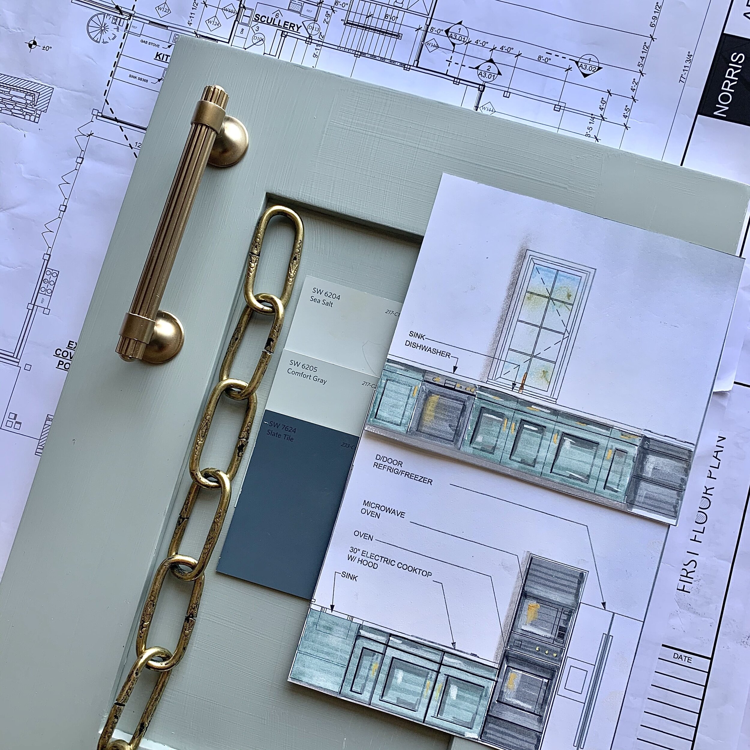
If you didn’t have a chance to see this picture on our IG feed this week, we’re happy to share it with you, because it is chock-full of undeniable eye candy.  It contains a dialogue of  beautiful textures; cabinetry, tile, hardware, carpet, and fabrics that we created a few weeks ago, and are sprinkled throughout this project. You will see more as we move on soon!

eP3RVJrQ.jpeg

In with the old

The kitchen in our modern farmhouse is growing by leaps and bounds (thanks to our chief, Brad Norris of Norris Architecture).... not only to accommodate our clients growing family... but also the many festive gatherings that are hosted here for family and friends. Our goal is to create spaces for our clients that feel so “at home”... that speak about their personalities and lifestyles, and spaces they love to share.

As we explained in the last blog, we are keeping our family’s favorite elements in the new main kitchen. Did you guess which ones? Drum roll please...who’s being invited to stay???

  1. the charming french Lacanche range

  2. the dashing custom studded hood

  3. the shimmery Currey and Co. pendants with the round glass orbs. (Our clients first request for the new kitchen was “Can we please keep the jewelry?”)

Kitchen “jewelry”

Kitchen “jewelry”

The handsome range and hood

The handsome range and hood

Layers of Color

Because the kitchen is truly the heart of the home, we’re not only adding one hard working island, but two that seat a total of  12 people. We know that beauty rules and functionality reigns, so of course!  They will have both. Beauty shows up in a big way with a colorful vintage Turkish Oushak runner sporting our lucious palette...a stunning mix of fabrics will be illuminated from our pendant lighting above, as new sparkly brass trimmed globes join our jeweled glass lights. Smaller, backless stools will sit on the kitchen side facing the shiny Lacanche and new cabinetry, and will rest under the countertop until needed. Comfy upholstered barstools await visitors behind the second 13’ island, for a restful spot to lounge.

JefZxC1g.jpeg

Entertainment Central

And let’s talk about the killer element of this dreamy space, because this kitchen has the most helpful partner one could ever ask for...a fully decked out scullery.

ZbHOrSGg.jpeg

This lively, gracious family entertains frequently! It could be a spur of the moment dinner for 20 or a fabulous event for 100. This is where the hard work happens...a caterer’s heaven. It contains a second sink, dishwasher, set of  Wolf double ovens, a Wolf cooktop and an abundance of beautiful sea salt blue painted cabinetry for extra storage. Best of all...it has doors to hide messes during parties and events. But we wonder...why would anyone ever close those doors? It’s going to be as stunning as the main kitchen!

Lighting that sparkles

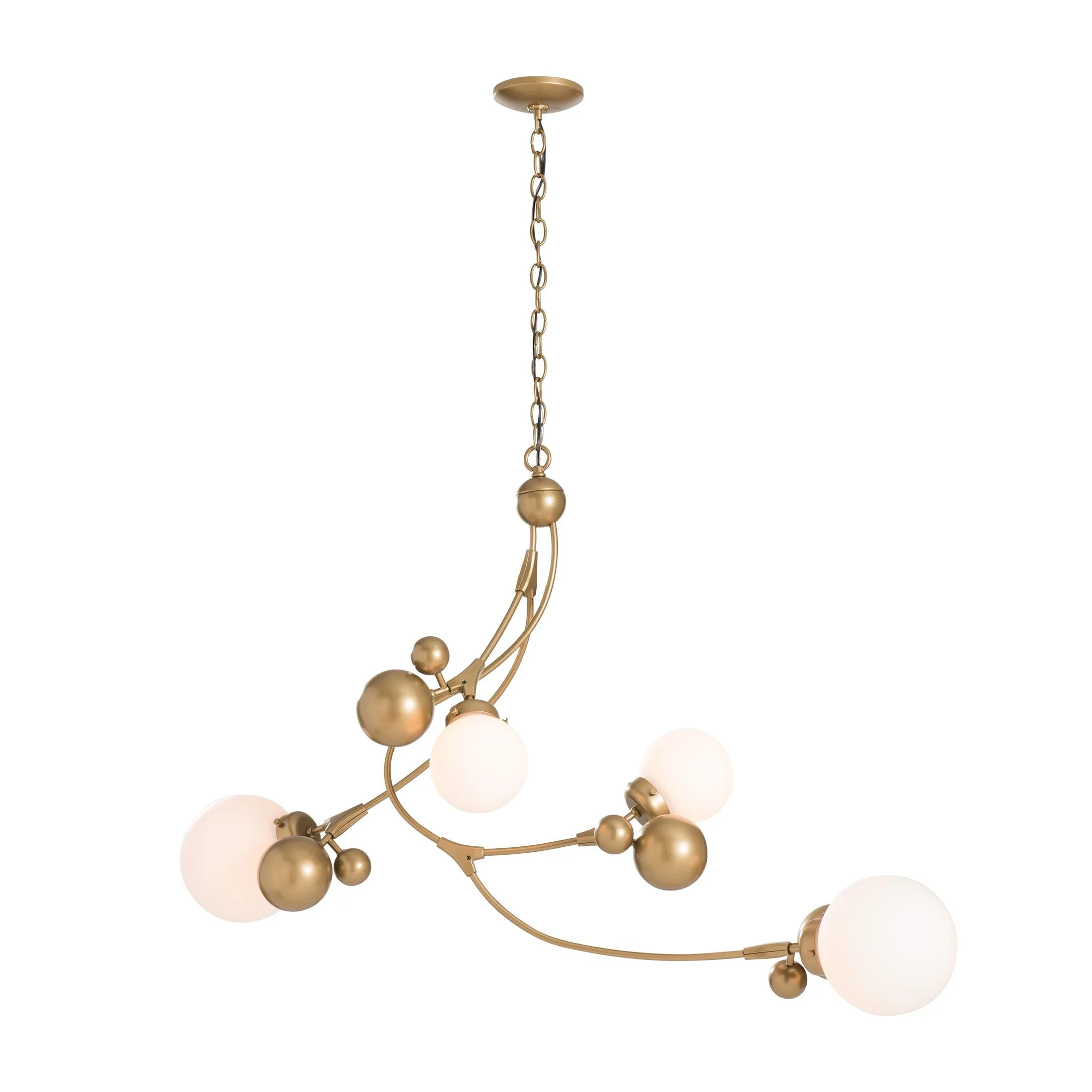
Following our last blog, we had several great questions about how to update and combine lighting styles, and how to make it work together...stay tuned! We’ll discuss how to mix it up in our next blog, and you won’t want to miss how we’re using this modern chandelier x 3 in the great room.

136420-SKT-25-GG0639_1.jpg

Yep! There will be three of these beauties!

A Beachy Surprise

Do you remember how we told you we had a big surprise we’re incorporating into this kitchen area? One that reminded our people of the beach...and all the happy memories they have gathered there? A large aquarium stocked with colorful fish (in our designer palette of course)... will anchor the second island, sitting between the scullery and the kitchen! 

Aquatic inspiration

Aquatic inspiration

IMG_2663.jpg

Au revoir

We’re a tiny bit melancholy as we are getting very close to saying bye-bye to the old space, and hello to the new…but excited to bring you the new great room in our next blog. Until then, be well, live with hope, and may every day bring you your best for the rest!

Screen Shot 2020-05-06 at 8.45.51 PM.png

The Story of Sticks & Stones | The Kitchen

EMR_6972.jpg

Ok friends, so do you agree with us...this charming kitchen is already gorgeous just like it is? But we’ve been so excited to share with you...we’re growing! 

IMG_1845.jpeg

Today, I’d like you to see the present kitchen so you will appreciate where we’re going in the next few months with the new addition. We’ll be keeping some of our favorite elements in the original kitchen, as we add new ones.

IMG_2663.jpg

Our goal for the new addition is to create a seamless transition between the two structures. This includes two fabulous working kitchens opening to a sun drenched great room, a luxurious master suite with a stunning master bath, three fun teenage bedrooms, a family-friendly game room and a multi-tasking mudroom/entry...more on those later!

IMG_2662.jpg

Who wouldn’t just love a charcoal grey Lacanche range with shiny brass knobs? (Gray and gold are a killer combination anywhere!) And she’s crowned with a gorgeous, studded custom hood that we designed for this space. 

If you adore this style of range as much as we do...we’ve rounded up a couple good options for you to see! (See Option 1 | See Option 2)

Casting light on the island

Casting light on the island

Remember the entry light? We’re using the same glass orb here.We love repeating similar elements throughout the house to create harmony.

Remember the entry light? We’re using the same glass orb here.

We love repeating similar elements throughout the house to create harmony.

Functionality rules and beauty reigns in this kitchen. The rough and weathered reclaimed ceiling pairs so perfectly with the shimmer of little glass orbs over the honed granite island. We love unexpected elements and a mix of materials.

Stunning eastern views from the wall of windows

Stunning eastern views from the wall of windows

Because the views at the kitchen sink are to die for (and overlook rolling green hills and a peaceful pond!) we chose to do a sweeping wall of windows instead of upper cabinets. But that presented the problem of where to put the necessary electrical outlets. But no worries! We sourced handy pop-up outlets that recessed into the granite countertops...pretty cool, right? Functional and seamless.

Although this space is stunning just as she is, the team of Norris Architecture and Post 31 Interiors is doubling its size to create a beautiful new entertaining kitchen including the coolest butler’s pantry. The home’s new addition will allow our fun-loving clients even more opportunities to welcome family and friends!

Think...two enormous, hard-working quartzite-topped islands, handsome secondary appliances, plenty of beautifully detailed cabinets for storage and a big surprise we’ll show you on the next blog. Can you guess?? Here’s a clue…this family loves the beach!

Galactic white Quartzite stone from Tate Ornamental

Galactic white Quartzite stone from Tate Ornamental

What do you think about all this excitement?? What are your favorite elements in the existing kitchen? Please do tell in the comments below!

Next week, a sneak peek on how we’re combining the distinguished old with the modern new in this addition, and a look at some of the gorgeous selections and finishes we’ve designed for our new addition.


Architecture credit: Norris Architecture
Professional photography: Emily Minton Redfield

The Story of Sticks & Stones | The Great Room Part I

Happy Friday Friends! As promised...welcome to the great room of this beautiful barn, where it is not unusual for people to enter, stop in their tracks to exclaim...”OH MY GOSH, HOW OLD IS THIS BARN”? 

Beautiful, authentic materials for this majestic structure (meaning “the real thing”) were sourced from several different areas. Reclaimed hand-hewn timber beams and flooring alongside Tennessee fieldstone create a new, modern structure, while holding an unspoken sense of history.

EMR_6929.jpg
EMR_8313.jpg

Lighting on a grand scale

Floating above this grand space are two enormous, double tier chandeliers that illuminate the room from above. When I presented our design of these two large pieces to my clients and our architect, I was met with “OH MY! Really? That large? BUT, ARE YOU SURE?” (This was spoken at least ten times with extreme concern.) Which OF COURSE created more than just a tinge of anxiety (truly my inner designer was freaking out). But, I stuck to my guns, trusted my instincts, and they went to production.

IMG_1514.jpeg

With a space this large, it was imperative to GO BIG OR GO HOME! Correct scale and proportion were critical in this space, and I knew they would hang beautifully among the upper clerestory windows. (Design tip...don’t forget that visually filling the upper space in a room is as important as the lower!)

EMR_8350+%28Emily+Redfield%27s+conflicted+copy+2016-05-12%29.jpg

Let the Sun shine in

One of my hands down favorite elements in this home are the fabulous windows. I get giddy over natural light...it is such a luxury, and I am smitten with every single one of these beauties. (The large one on the stone wall is 14 feet tall!)

IMG_1513.jpeg

I also adore the drapery and the juxtaposition of the Belgian linen skipping over the fieldstone walls...almost like understated, couture ball gowns softening the rough and tumble stone.

Again, IT’S THE MIX NOT THE MATCH,  and I love the interesting narrative and subtle dialogue contrasting elements provide.

Art by Lynn Sanders

Adding the art

We were THRILLED to find this stunning piece of art by Lynn Sanders (vintage Lynn Sanders, 5 years old) to fill the shiplapped wall by the sectional...and when sweet Lynn offered to come sign her art, it was the icing on the cake! We adore original art, and the soul it brings to our work. (I’ll give you THE LOW DOWN on hanging fixtures and art...scale and proportion, how high, etc. in an upcoming blog.)

IMG_1519.jpeg
IMG_0667+copy.jpg

Layers of Luxury

One of my favorite sayings is...“LET PEOPLE BE THE COLOR IN A SPACE” and that is the case here! Our family exudes a gracious joy that fills this space with it’s own vibrant color. Textured neutrals show up in smokey leather, golden linen, sumptuous velvet, soft wools, organic hide, and fluffy boucle and fur…and are peppered with metallic finishes and colored glass throughout for a little sparkle and shine.

And as for the other side of this grand space...STAY TUNED. We’re headed that way in a future post! Until then...here’s a peek at the excitement happening outside!

Addition coming soon!

Addition coming soon!

Professional photography: Emily Minton Redfield